Datatable View
The datatable is where the data contained in an object store is displayed in a grid view. Combinable filters allow to narrow down the displayed data in a variety of ways. And the data can be edited or deleted individually, in any selection, or in its entirety. If a table is empty, data can be imported if it is in Dexie, JSON, or CSV format. Or, the javascript textarea can be used to insert records.
-
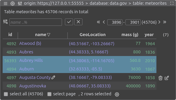
The caption informs about the name and number of records in the displayed table.
-
With the icon on the left side of the filter elements the filter configuration can be invoked, allowing you to add, edit, or remove filters.
-
All filters configured for the table are displayed side by side. The order can be adjusted via drag & drop in the filter configuration. As long as no search value is entered and always when hovering with the mouse, the name of the filter field and the filter type are visible.
-
The search is triggered when the button is clicked or by pressing the Return key while entering a search value. Clicking the button resets all search fields. Search entries are saved as part of the filter configuration so that they remain active when a table is accessed again at a later time.
-
The table navigation consists of the four chevron buttons to scroll forward and backward through the records, two input fields to display and enter the start and end position of the displayed records and the total number of records that correspond to the search entries. How many records are displayed per page is set in the behavior configuration.
-
The order of the datatable columns is set via drag & drop in the column configuration. While the mouse is over a column heading, the column's delimiters are visible and can be dragged to adjust its width. A triangle icon indicates whether a column is sorted in ascending or descending order. To sort a column or change the sorting direction, click the column heading. Sorting data columns that contain non-indexed data can be very slow for tables with many records. Double-clicking on the heading of a sorted column will terminate the sorting. The column sorting is saved as part of the column configuration and remains active when the table is accessed again later.
-
An indicator that signals the presence of columns not currently displayed in the datatable. These may be columns that have been manually hidden in the column configuration, or newly discovered columns encountered while scrolling through the data, when the system is configured not to display such columns automatically. When hovering over the number, a tooltip appears showing details about the hidden columns, along with an icon that serves as a shortcut to the column configuration.
-
Clicking on a data row selects the row, clicking again deselects it. Selected rows are displayed with a different background color, and their total number is shown in .
-
When hovering over a displayed value a icon appears. By clicking on the icon the value editor is summoned, allowing to change the value and its type.
-
When the mouse hover over a table row, icons appear that allow to delete or edit the displayed data. The editing of row data is done in a textarea below the datatable as javascript code.
-
Below the datatable, information about and actions for the selected records are displayed. The select all checkbox de-/selects all data rows that are displayed based on the filter entries. The select page checkbox does the same with the data rows currently displayed on the screen. The icon behind the number of selected records is used to display the selection tools.
Table Tools
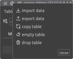
While in the datatable view, the table tools are accessed via the icon displayed in the window title. In addition, the table tools can be accessed by clicking on the gear icon that appears when hovering over a row of the table list in the database view.
Import Data
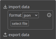
Select which data format to use for the import: Dexie, JSON or CSV. After a file is selected, the contained data is imported into the displayed table and when finished, the datatable view is updated. Hovering over the icon displays the relevant import settings for the selected format and provides a shortcut to adjust the import configuration.
Export Data
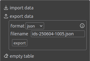
Using the dropdown list, the export format can be changed between Dexie format, JSON and CSV. The file name for the export file follows the pattern saved in the export configuration. If the filename field is selected, the pattern is displayed and can be edited. A modified pattern is saved in the configuration of the table. If the mouse hovers over the icon, a layer with the export settings relevant for the selected format is displayed. The icon present in this settings layer can be used to adjust the export configuration.
Copy Table
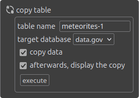
In copy table a copy of the source table is created by clicking on the execute button. The table name to use for the newly created table is pre-filled with an unique name. All existing host databases can be selected as target database with the default that the table is created in the source database.
If copy data is not checked, an empty table is created with the indexes of the source table. The last checkbox determines what happens after the copy is created, whether the copy is displayed afterwards or whether the view of the source table remains.
Empty Table
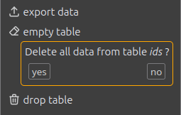
By clicking on empty table and subsequent confirming, all existing records will be deleted from the table.
Drop Table
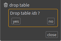
After confirmation, the table and all data it contains will be irrevocably deleted. Since the action modifies the database schema, the database version is incremented by 1.
Value Editor
Clicking the pencil icon that appears to the right of a displayed value when the mouse is hovering it opens the Value Editor.
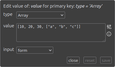
Below the heading that displays the field name of the edited value and the primary key for its selection, the form consists of three areas: selecting the type, displaying and editing the value, and for selecting the input method.
When selecting the type, all data types supported by IndexedDB are available. In Chromium browsers, this includes 44 types, and in Firefox, 40 types. In alphabetical order, these are
Array, ArrayBuffer, BigInt, BigInt64Array, BigUint64Array, Blob, Boolean, CryptoKey, DataView, Date, DOMException, DOMMatrix, DOMMatrixReadonly, DOMPoint, DOMPointReadonly, DOMQuad, DOMRect, DOMRectReadonly, Error, File, FileList, FileSystemDirectoryHandle, FileSystemFileHandle, Float16Array, Float32Array, Float64Array, ImageBitmap, ImageData, Int16Array, Int32Array, Int8Array, Map, Null, Number, Object, RegExp, RTCCertificate, Set, String, Uint16Array, Uint32Array, Uint8Array, Uint8ClampedArray and Undefined.
However, Float16Array, FileSystemDirectoryHandle, FileSystemFileHandle and ImageBitmap are missing from the selection in Firefox because they are not supported there. And expect various complications if you store RTCCertificates in IndexedDB.
If the type in the selection is changed, the existing value is transformed from the previous type to the new type wherever this makes sense. For example, it is possible to switch back and forth between Array and Set or between Date and String.
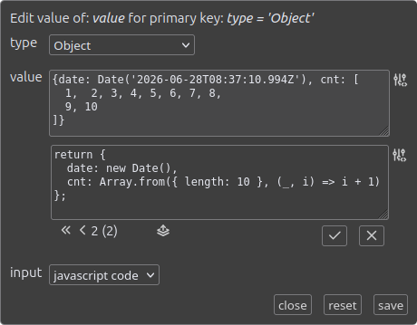
The value section is used for display and modification. For many types, editing can be done in an HTML form. And for all types the value can be manipulated by applying Javascript code, provided that for the host the execution of Javascript code is not prevented by CSP rules. If an icon is displayed next to the form, it provides instructions on how to enter valid data for that type. The icon is also context-dependent and provides access to options that, when selected, are saved for values of this type in the current table column.
The available input methods depend on the data type. The method javascript code is available for all data types if Kahuna is allowed to execute Javascript on the host. A javascript textarea is used for code input. The code can access the current data value using the variable value, and the returned value is set as the new data value. The other global variables of the javascript textarea are also available.
Using form as an input method, the value of most data types can be changed in an HTML form. When entering data into a form, there are often rules to follow or restrictions, the details of which are described by the icon. For example, JSON syntax must be used for the data types Array and Object. Other input methods include upload of files (i.e. image, text, CSV or JSON data), and Date values can be entered as timestamp integers.
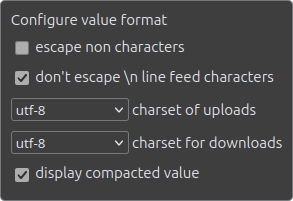
A icon is displayed to the right of the form input and also to the right of the javascript textarea, allowing to adjust formatting settings. Customized settings are retained for each table and each data field.
The options offered depend on the data type and the input method. The first two options are offered for strings and all data types that can contain strings and whose representation can possibly be improved by escaping. The character sets for uploads and downloads are relevant for strings. And the upload character set is also relevant for imported CSV and JSON files. display compacted value is preselected for very large data values where displaying the details could potentially slow down the browser. However, editing within the form is not possible with the compact display.
Selection Tools
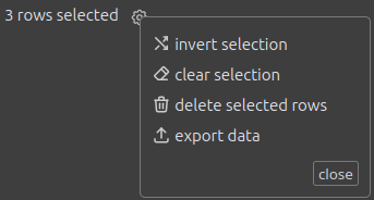
Clicking on the icon, which appears below the data table as soon as data records are selected, opens the layer with the tools available for actions on the selection.
By using invert selection the selection state is changed for all records in the table.
After using clear selection no records are selected anymore.
delete selected rows will ask for confirmation before the selected data sets are deleted from the table.
export data in the selection tools exports the selected data records in Dexie, JSON or CSV format. Except for the limitation of the amount of data by the selection, the use is identical to the table tools: export functionality. The settings available when exporting are described in the Configuration / Export section.
JavaScript Textarea
The text area is displayed below the data table by default, but can be hidden in the behavior configuration, item . In addition to executing arbitrary JavaScript, the text area is used to edit data records (see item above) and to edit individual data values within the value editor.
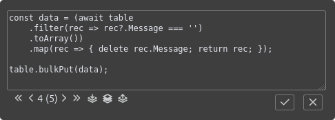
Some global variables are available for use in the JavaScript code:
| Name | Value |
|---|---|
| db | Dexie database object as returned from await Dexie.open('dbname') of the currently selected database. |
| table | Dexie Table object of the currently selected object store. |
| selection | Dexie Collection object of the selected data records. |
| row | a JavaScript object holding the data of a record that has been selected for editing. Only available when editing row data. |
| value | The data value of the table cell that was selected for editing. Only available within the value editor. |
| Dexie | A global Dexie instance that can be used to open other IndexedDB databases. |
The chevron navigation below the textarea can be used to switch between saved JavaScript codes. If the navigation is in the first position, the letter u signals that the code is unsaved. The icons on the right side of the navigation appear depending on the state of the entered code. The icon is used to save a new code, the to update a changed code and the to delete a previously saved code.